

What Is Responsive Website Design?
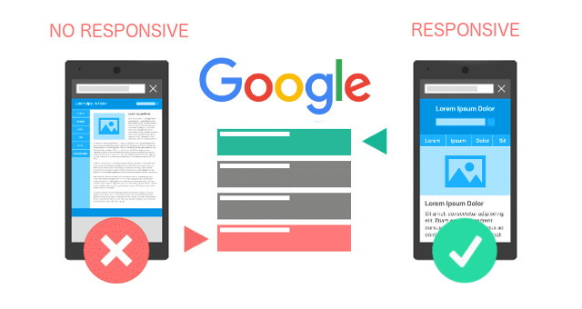
Responsive web design is a technology in web design and web development that makes webpages display appropriately across all screen sizes and devices. Responsive websites automatically adjust and adapt to any device screen size, whether it is a desktop, a laptop, a tablet, a mobile phone, or a smartwatch.
Content (text, images, videos) will resize or stack on top of each other to display it properly no matter the screen size.

One Website, Many Devices
With new devices in different screen sizes available every year, it is important that your website look awesome no matter the screen size. According to Google, If a website pops up in search results and it isn’t mobile friendly, 40% of website visitors will go back and choose a different result/website.
How Does Responsive Web Design Work?
Developing a mobile responsive website includes a set of coding rules to set website content in columns, rows, and containers that will simply overlay one to another. As screen sizes become smaller, content starts to take up more vertical space and anything below will be pushed down.
In the following coding example we can define the different “styles” to be assigned depending on the screen size.
/* ———– iPhone 4 and 4S ———– */

/* Portrait and Landscape */
@media only screen
and (min-device-width: 320px)
and (max-device-width: 480px)
and (-webkit-min-device-pixel-ratio: 2) {

}

/* Portrait */
@media only screen
and (min-device-width: 320px)
and (max-device-width: 480px)
and (-webkit-min-device-pixel-ratio: 2)
and (orientation: portrait) {
}

/* Landscape */
@media only screen
and (min-device-width: 320px)
and (max-device-width: 480px)
and (-webkit-min-device-pixel-ratio: 2)
and (orientation: landscape) {
Can any website be converted to mobile responsive?
The answer is Yes. Any website can be converted to be mobile responsive. Some require some basic tweaking while others need some major overhaul. It all depends on the technology that the website was built with. For example, a CMS (Content Management System) like WordPress, Drupal or ASP.NET website will be easier to convert due to the use of templates while a static website (HTML, CSS, and javascript) will require some major code additions.
If you are currently in discussions with a web agency about a new website or website redesign and they don’t offer to build your website mobile responsive, I have only one thing to say to you: RUN, RUN!
Why Should I Care About Responsive Design?
Google and all major search engines will now punish you with rankings if you don’t have a mobile friendly website. Maintaining only one site is more cost-effective, and visitors will have better user experience which translates to more conversions.
Nearly 8 out of every 10 consumers would stop engaging with a piece of content if it didn’t display well on the device they were using.
Is a responsive website more expensive?
The answer should be No. But there are still digital agencies companies that will charge you extra for developing a responsive website. Developing mobile responsive websites nowadays is pretty easy due to the use of open source (Free) frameworks and technologies like bootstrap, foundation, skeleton and many more that make responsive web development very easy and affordable. If someone is trying to sell you an outdated non-responsive website, its time to look for a professional agency.
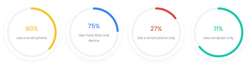
Device Usage and Statistics – 2018
Numbers do not lie, Over the years we have seen a shift in device usage and here we have the major numbers and statistics to help you decide why going mobile responsive is the best for your website.
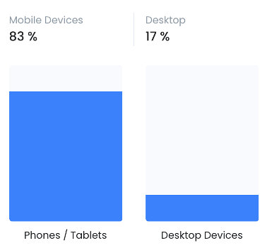
Desktop Vs Smart Phone Usage
Many devices are still used throughout any given day, but smartphones has now become the dominant device for people On The Go.
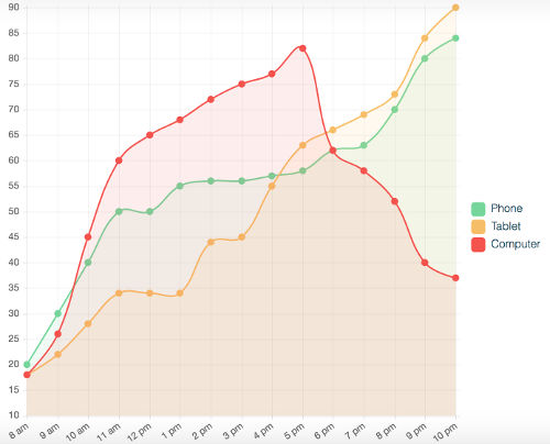
The average person spends 3 hours per day on mobile devices, 68 % of emails are opened in a mobile device, desktops dominate working hours, and by some estimates, 70% of all Internet access is mostly mobile.
Internet device usage
We hope with this data we are able to demonstrate the importance of developing a responsive website not only for better user experience but to comply with search engine standards which translates to better rankings, more visitors, and more sales.